CREATIVE DIRECTION
*
CREATIVE DIRECTION *
ALLEN HALL ADVERTISING
NOT YOUR AVERAGE STUDENT RUN AGENCY
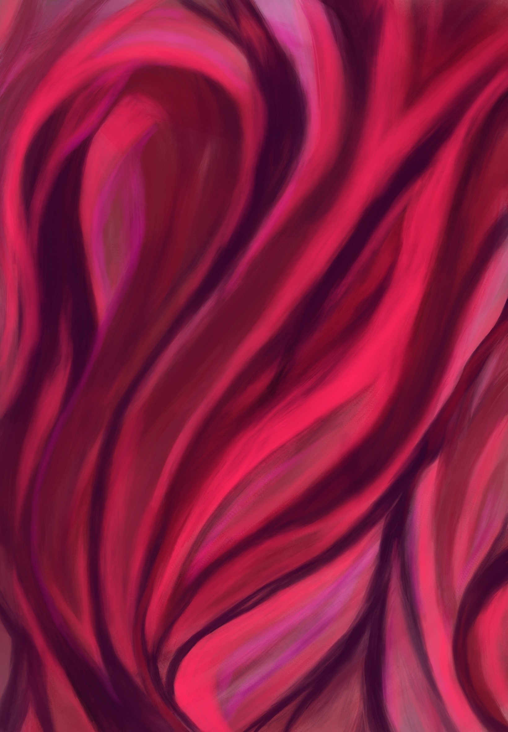
BE THE NOISE
BE THE NOISE
CLIENT: The UNIVERSITY OF OREGON DUCKS BASKETBALL TEAM
MY ROLE: ART DIRECTOR
THE ASK: How can we transform the Oregon Basketball games attendance into a ritual that builds the community?
THE INSIGHT: Inconsistent schedules and a lack of shared identity have made it difficult for fans to form lasting connections with the team. We recognized that to build a devoted fan base, we needed to design not just a campaign, but an experience that transcends beyond the court.
THE IDEA: Craft a game-day atmosphere that’s magnetic—where energy builds before tip-off and lingers after the kinesthetic experience of the game. We aimed to create a visual language that transcended gender, age, and background. We leaned into universal tones, textures, and emotions—designing the campaign.
THE RESULTS: A campaign that didn’t just increase attendance—it reimagined the Oregon Basketball experience and gave the community a reason to show up, stay loud, and come back.

BRING THE ENERGY


THE TEAM
PRODUCERS: ELIOT CORRELL, SHYLA OQUIRA
DESIGN: COLBY WISSMILLER, DYLAN SQUIRES, TOMMY BOWERS
ART DIRECTION: Camille Andrews, JADE MERVER
COPY: MISSY APPEL, FIONA ENGLISH
ACCOUNT MANAGEMENT: GRACE CLARY, ALEX GRAY
PROJECT MANAGEMENT: CONNOR UEYAMA, OLIVIA KOEBERLE
STRATEGY: ZOE DAY
MEDIA PLANNING: KAY PETERS, ALEC DUGGAN, ELISABETH PLUM
ALLEN HALL ADVERTISING 2024/2025 REEL
MY ROLE: ART DIRECTOR & ASSIST
When trying to imagine concepts to portray the identity of Allen Hall and the work we completed as a team in a single promotional video—it was something we knew had to be transformative and show how AHA transcends beyond the borders of the University and has firm roots in the real world. We positioned the work we do in Allen Hall Advertising as a creative think tank where identities, concepts, and ideas are birthed, uploaded, and deployed into the real world—hence the tones of retrofuturism.
The Team
BRAND MANAGER & STARRING: SAMMY KUNODY
SHOT & EDITED BY DYLAN SQUIRES
CAMERA 2: THOMAS BOWERS
CAMERA 3: EMMA HARRIS
ART DIRECTION: CAMILLE ANDREWS
ASSIST: WALLIS BLIVIN, SYDNEY TALL, STELLA RANELETTI, CAMILLE ANDREWS
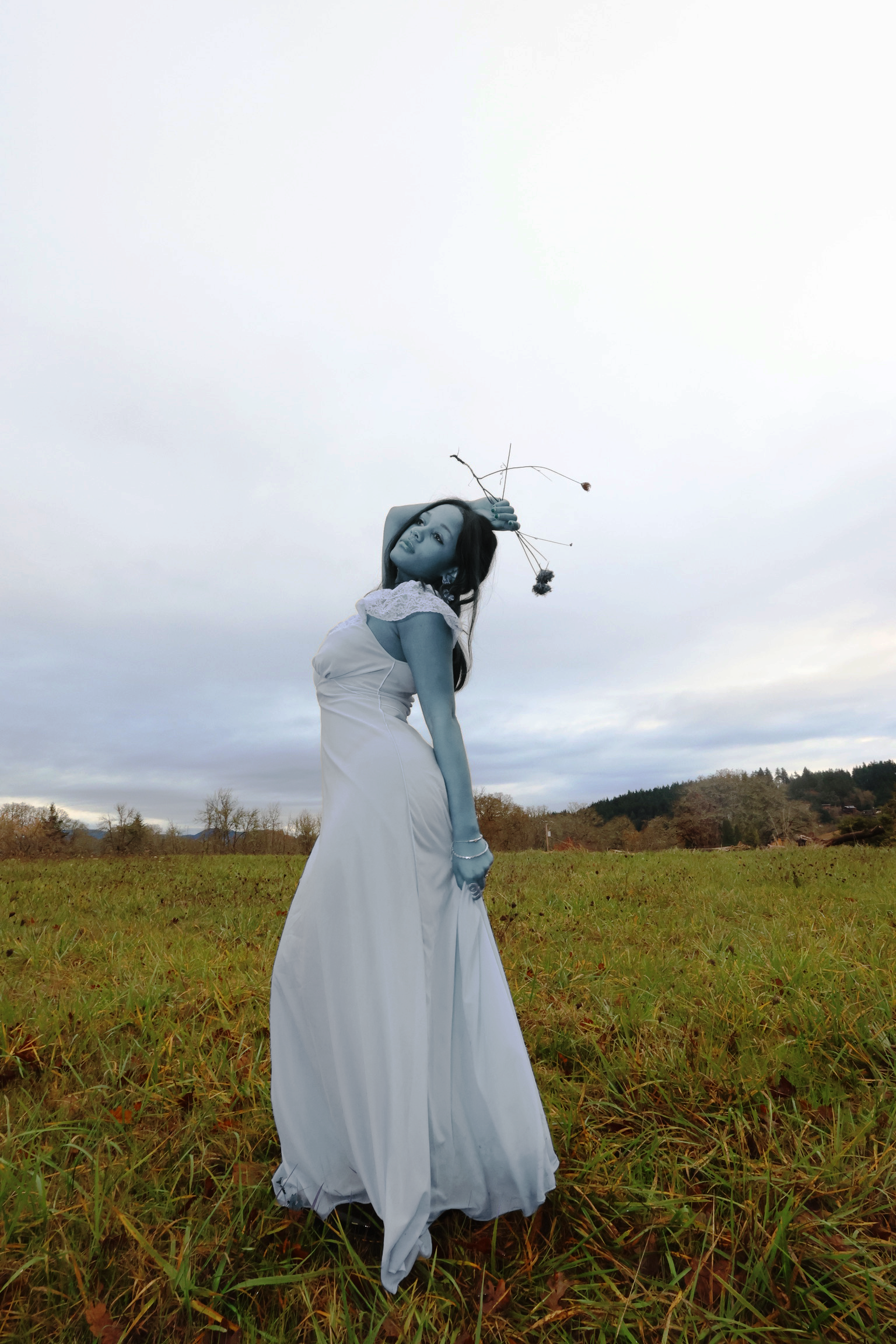
align magazine
“ARTIFICIAL”
2024
CREATIVE DIRECTOR: CAMILLE ANDREWS
PHOTOGRAPHER: MARY GROSSWENDT
MODEL: ANASTASIA IRVINE
For Align’s “Artificial” issue, I wanted to shift to a distant uncanny future. A female cyborg with human characteristics and traits to showcase a mutation between humans and technology. In the world depicted in this project humans have become imbedded within the artificial world, and technology has fully morphed and connected to the human consciousness like a wire.


CREATIVE DIRECTOR: CAMILLE ANDREWS
PHOTOGRAPHER: SNEHA CHOPRA
MODELS: MELODY MOSES, CHI-AN LU, SHALOM YEMANE
align magazine
“THE 411”
2023
For Align’s “411” issue, I created and alternate dream world, driven by the Goddesses Greek mythology. This world I created reimagines the divine feminine as something deeply human—despite being powerful beings still crave connection and the ritual of checking in on one another. It’s all about myth meaning mundanity: a timeless conversation drapes in pearls, light rays, and soft floral pastels. This world illustrates how connection, friendship, and storytelling intersect when women create space for one another to simply exist, reflect, and feel seen


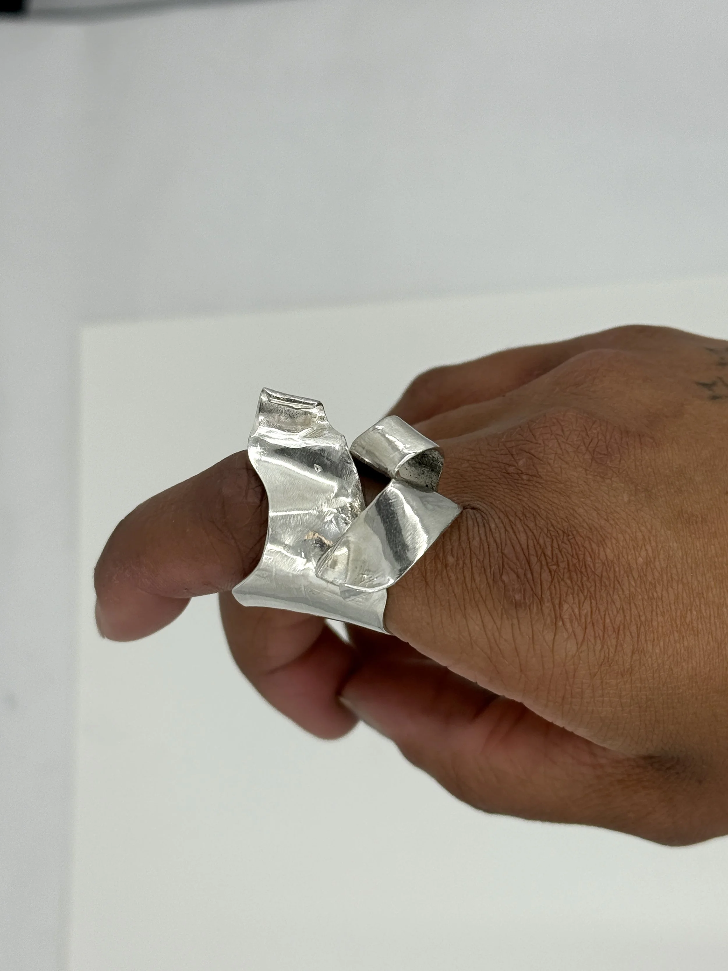
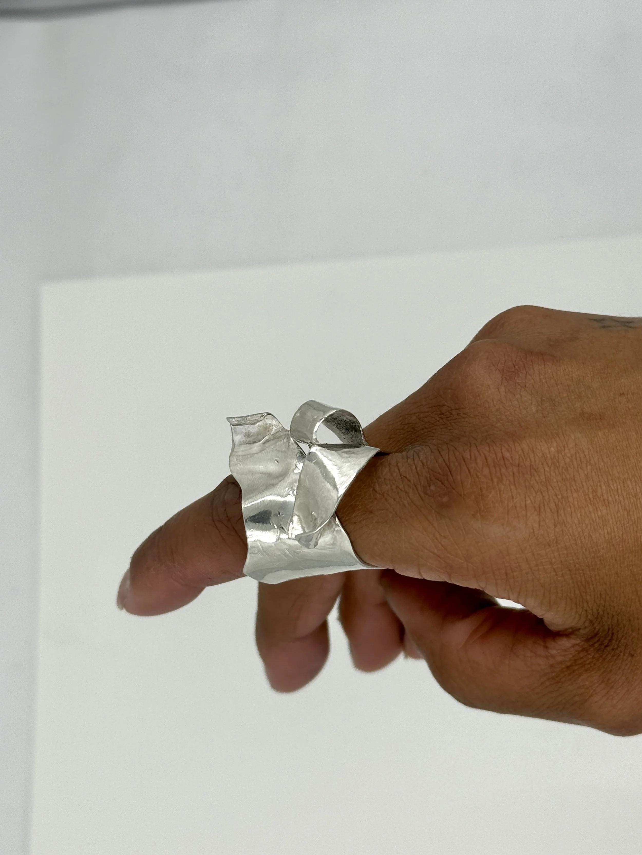
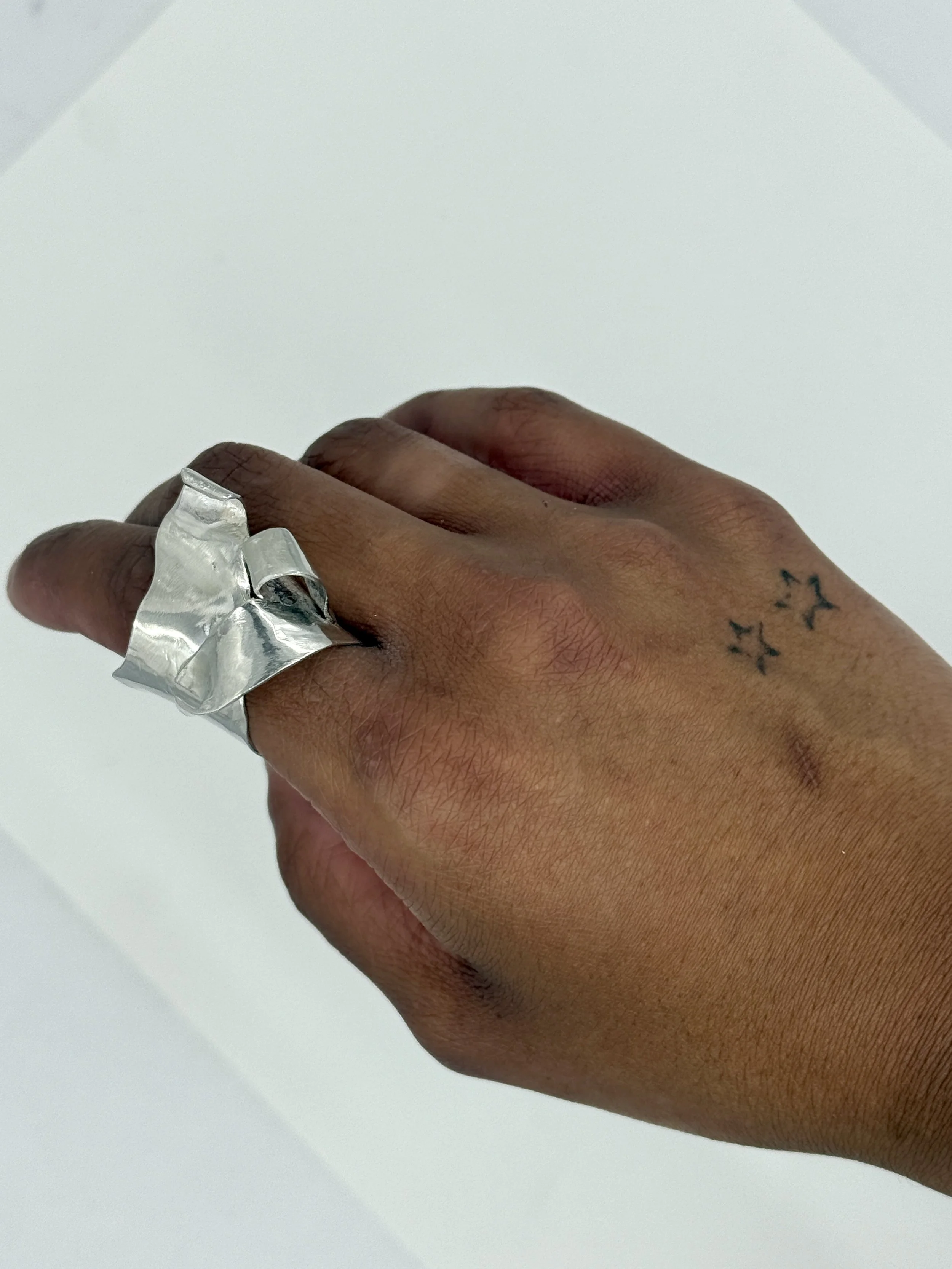
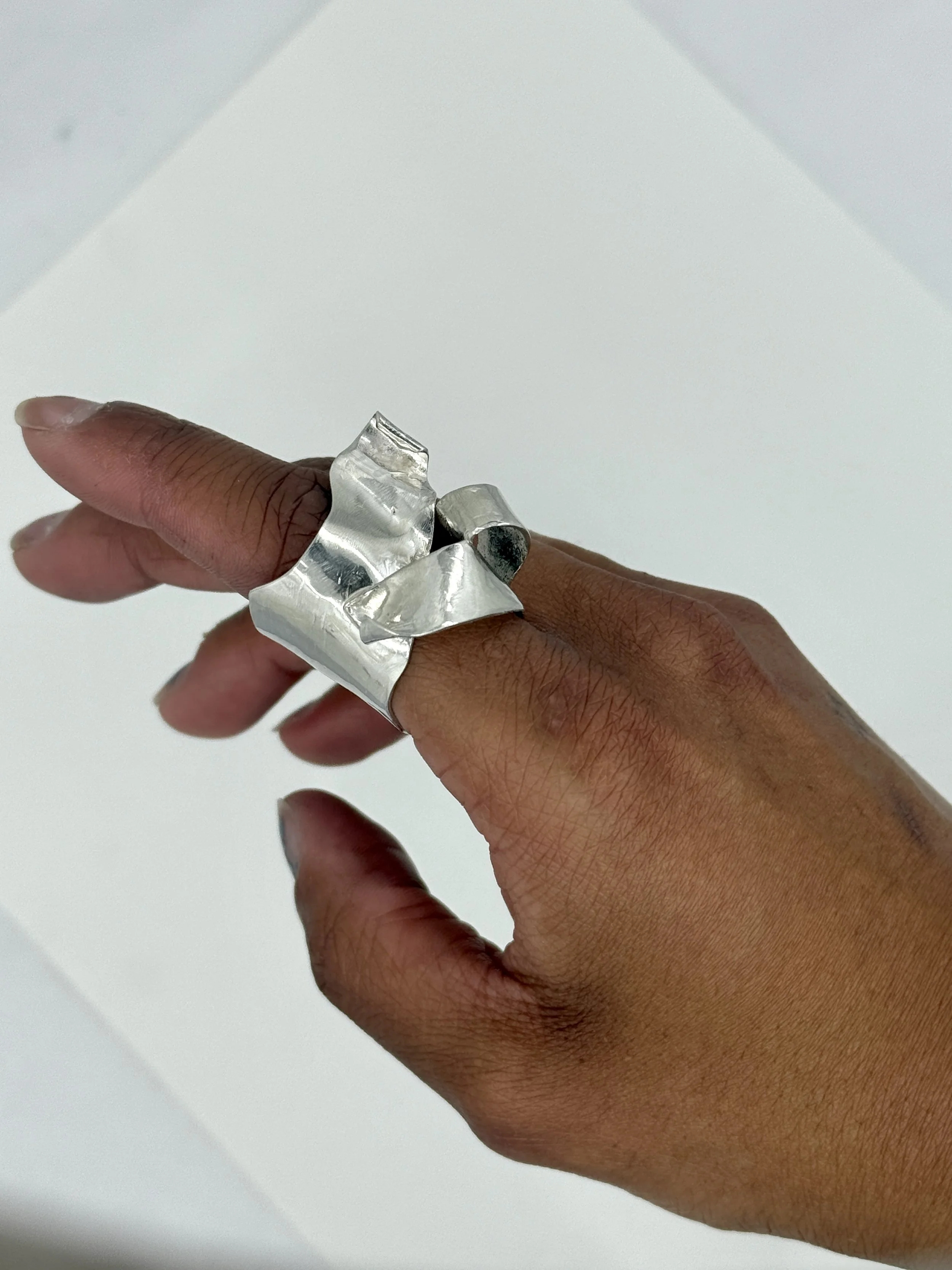
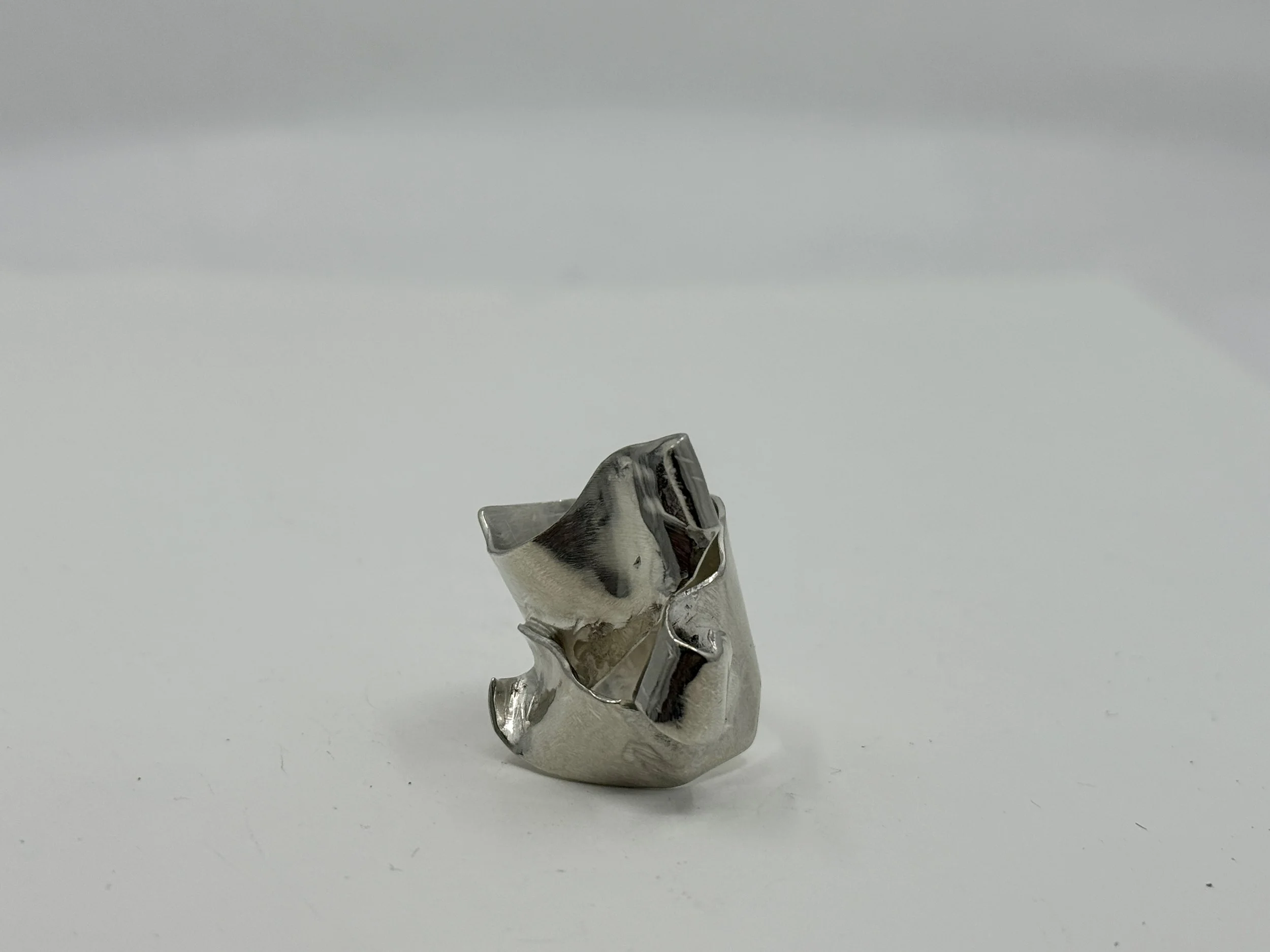
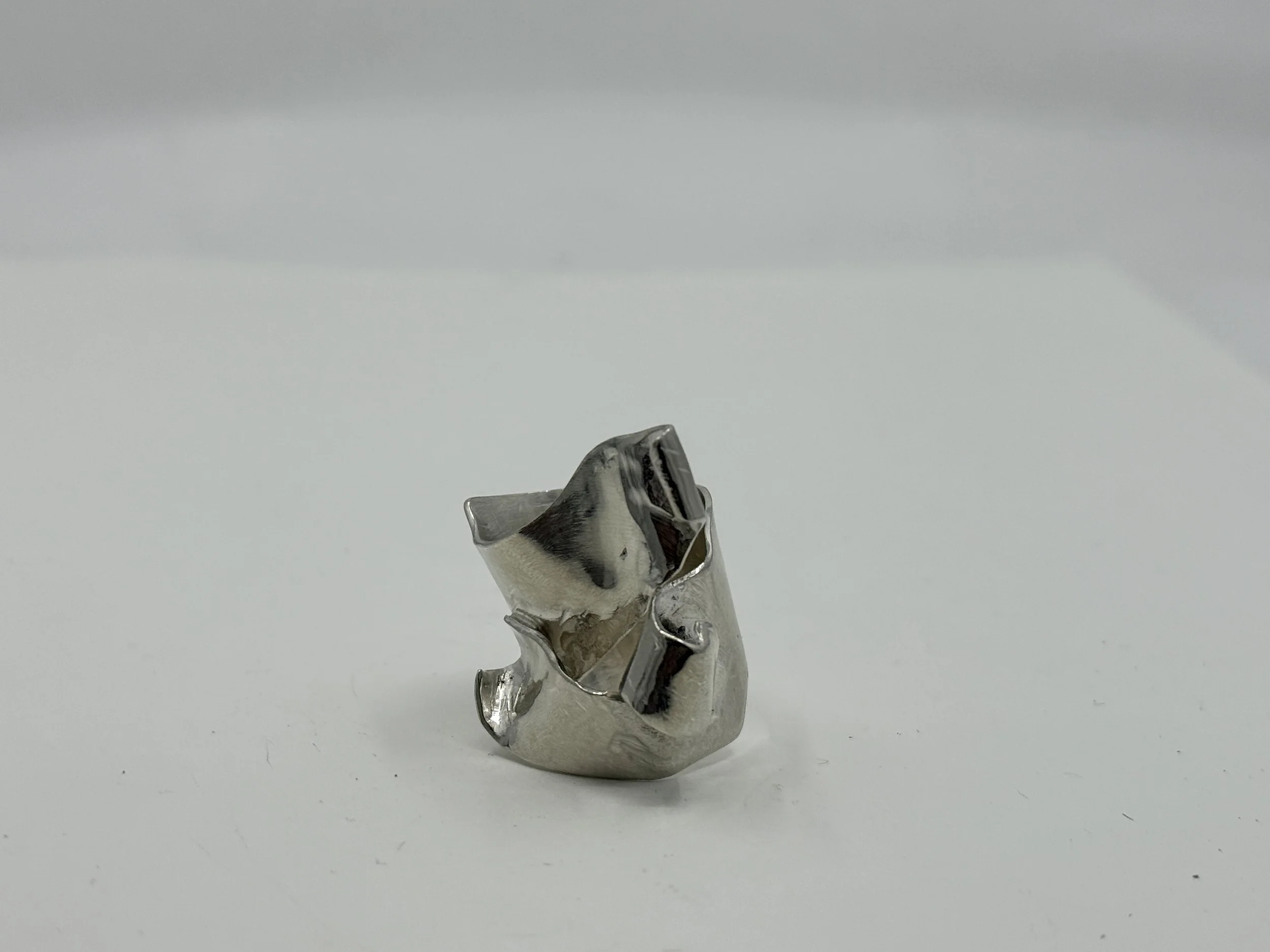
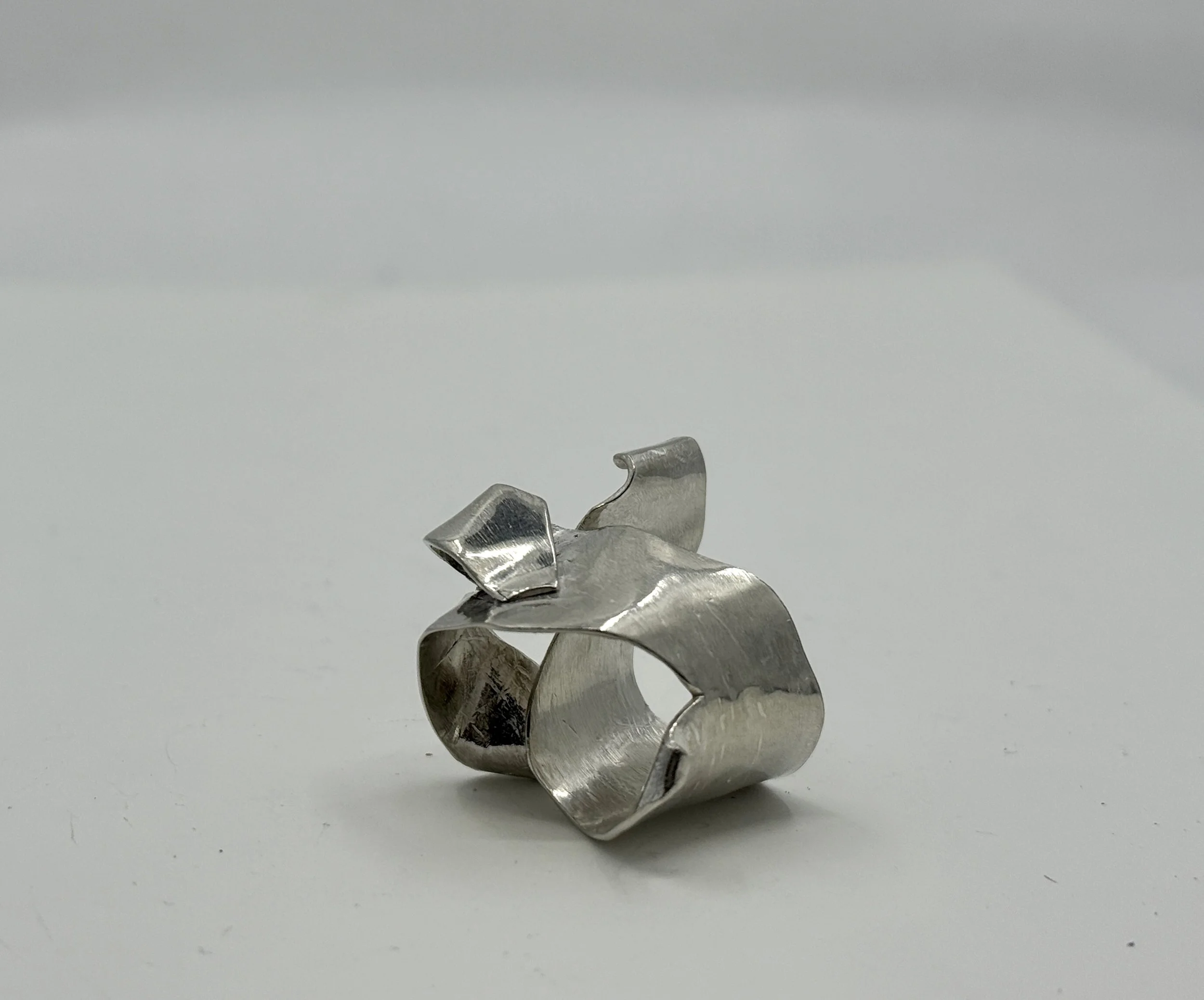
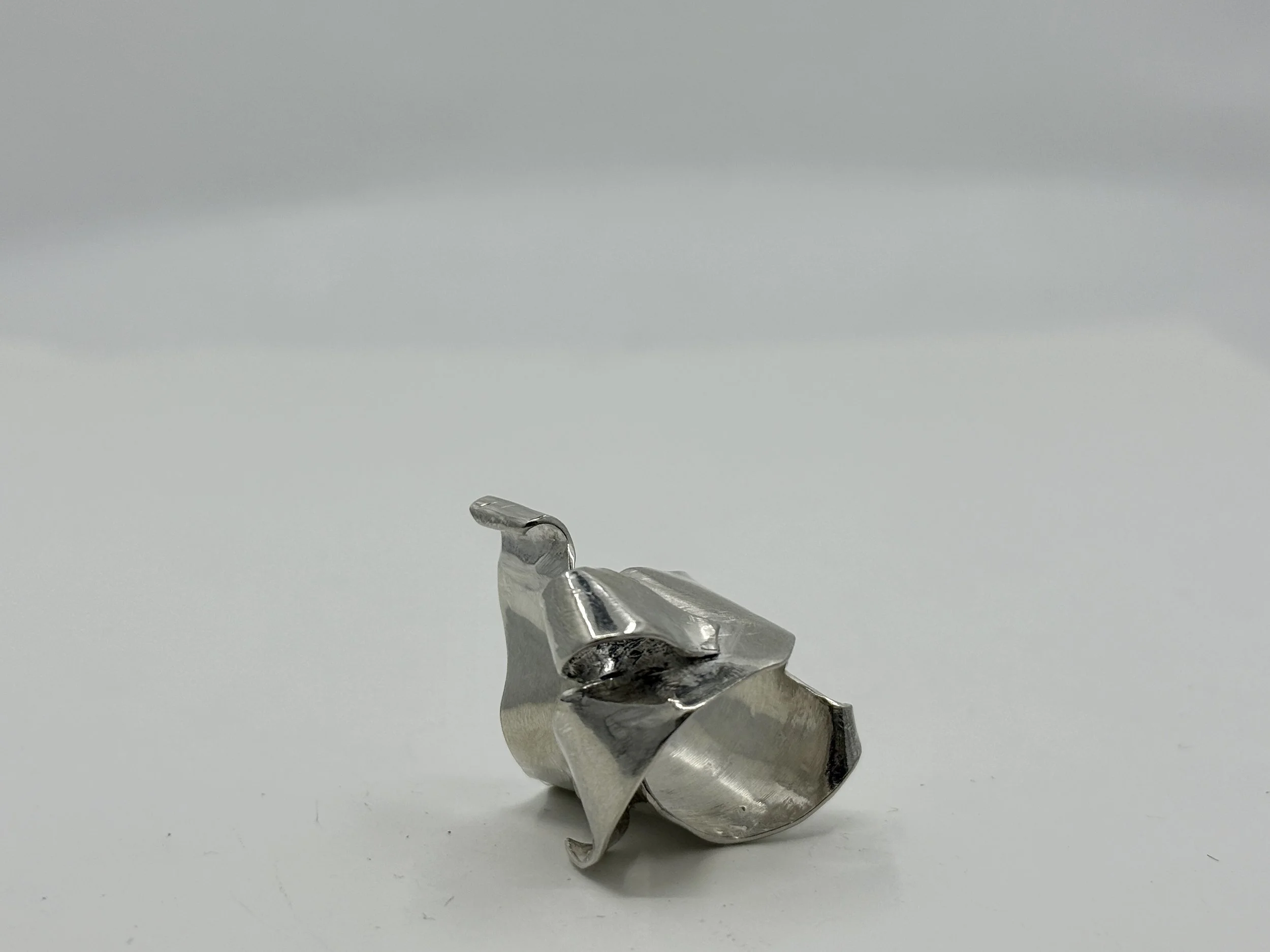
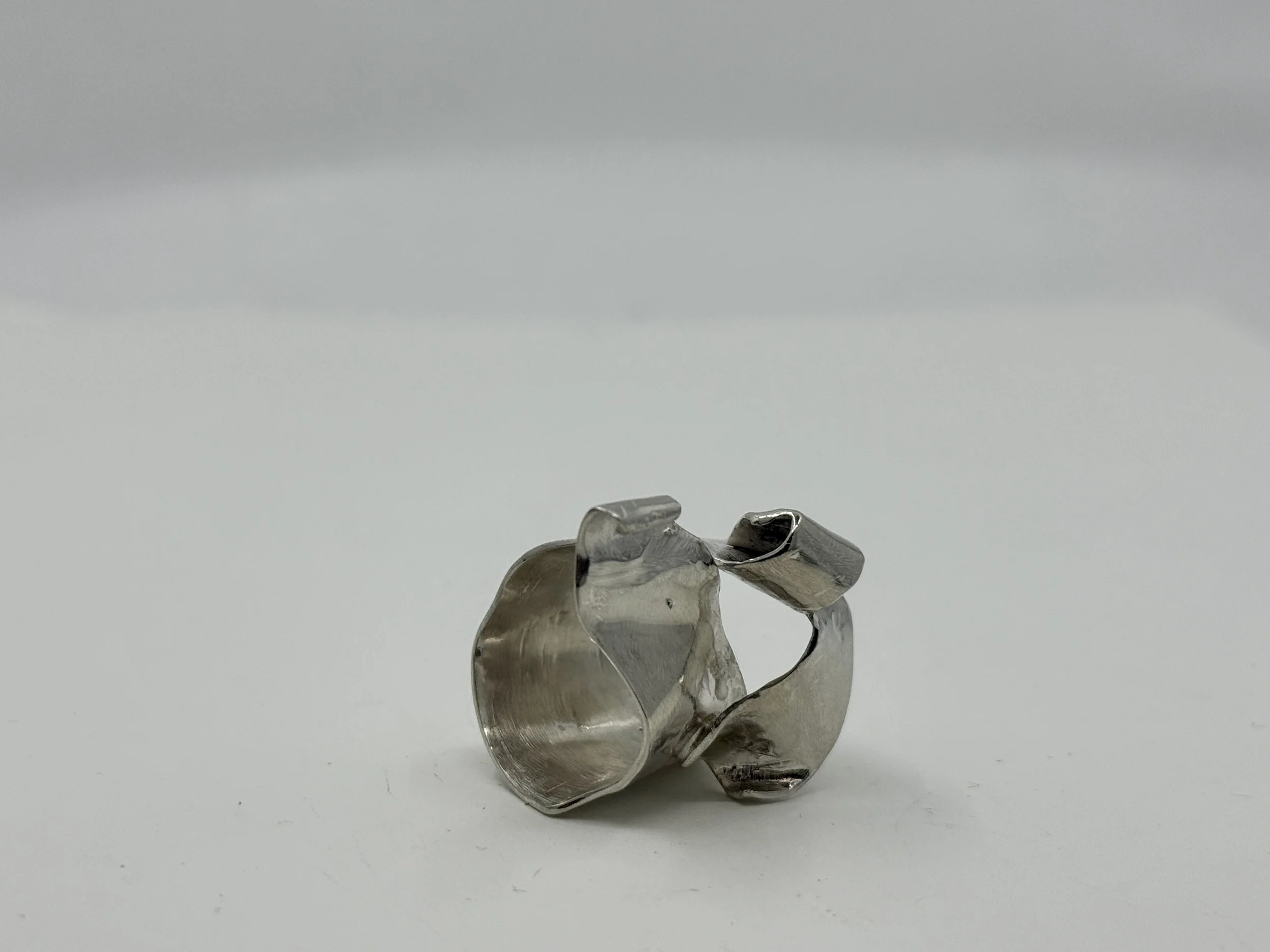
TURNING PAGES rING
Camille Andrews
2025
sterling silver
I wanted this ring to have a very organic flow to it, and appear to have pages tearing into little organic folds. I had no intentional plan when I began the ring—I didn’t even size it out. Instead I simply started forming some spare sterling silver I had around in various ways to create different shapes, forms, lines, and curves. I wanted it to feel like an extension of my finger out onto the earth. It is especially formed, shaped, and customized to my finger which I believe makes the piece all the more monumental and special.

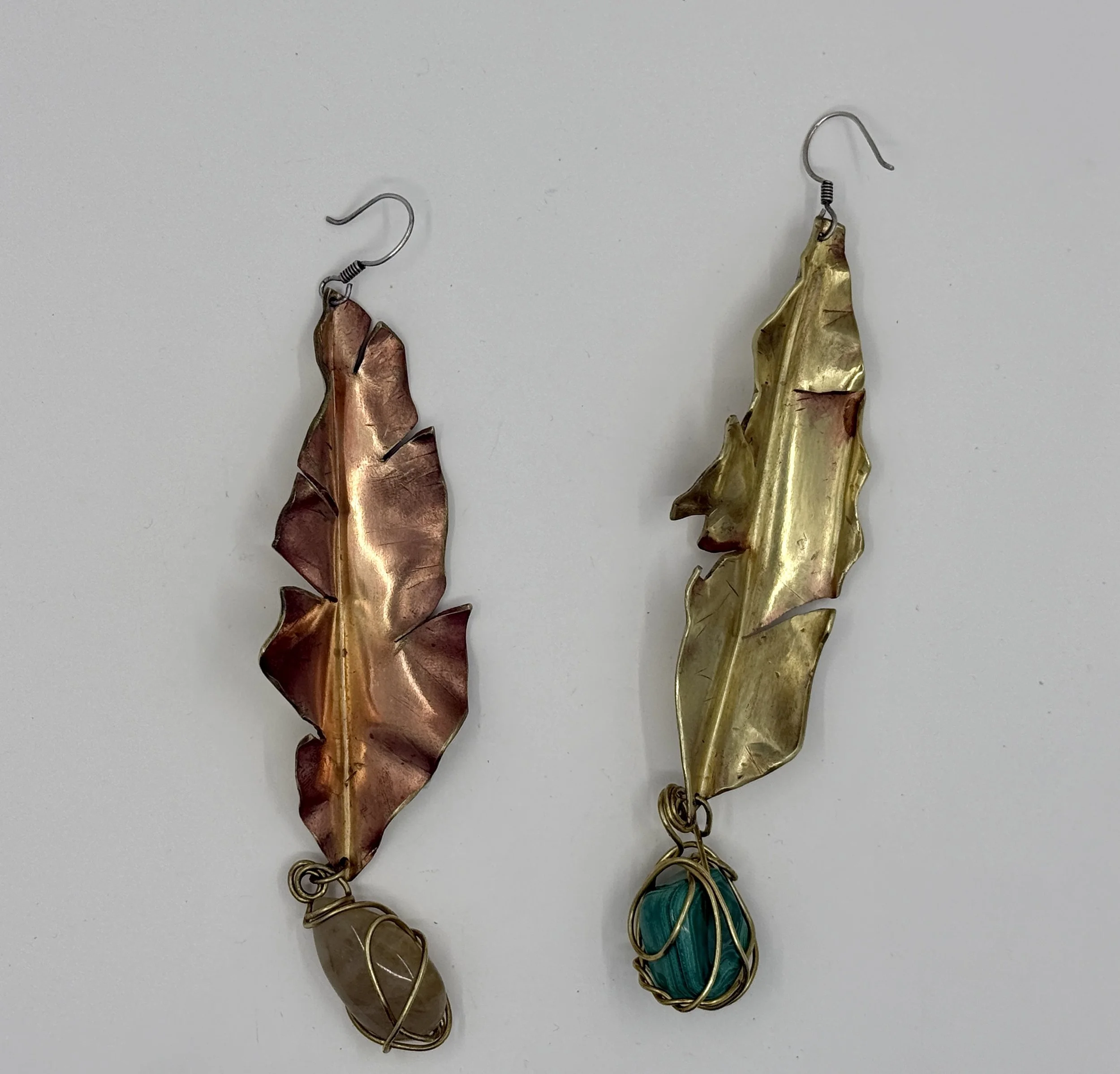
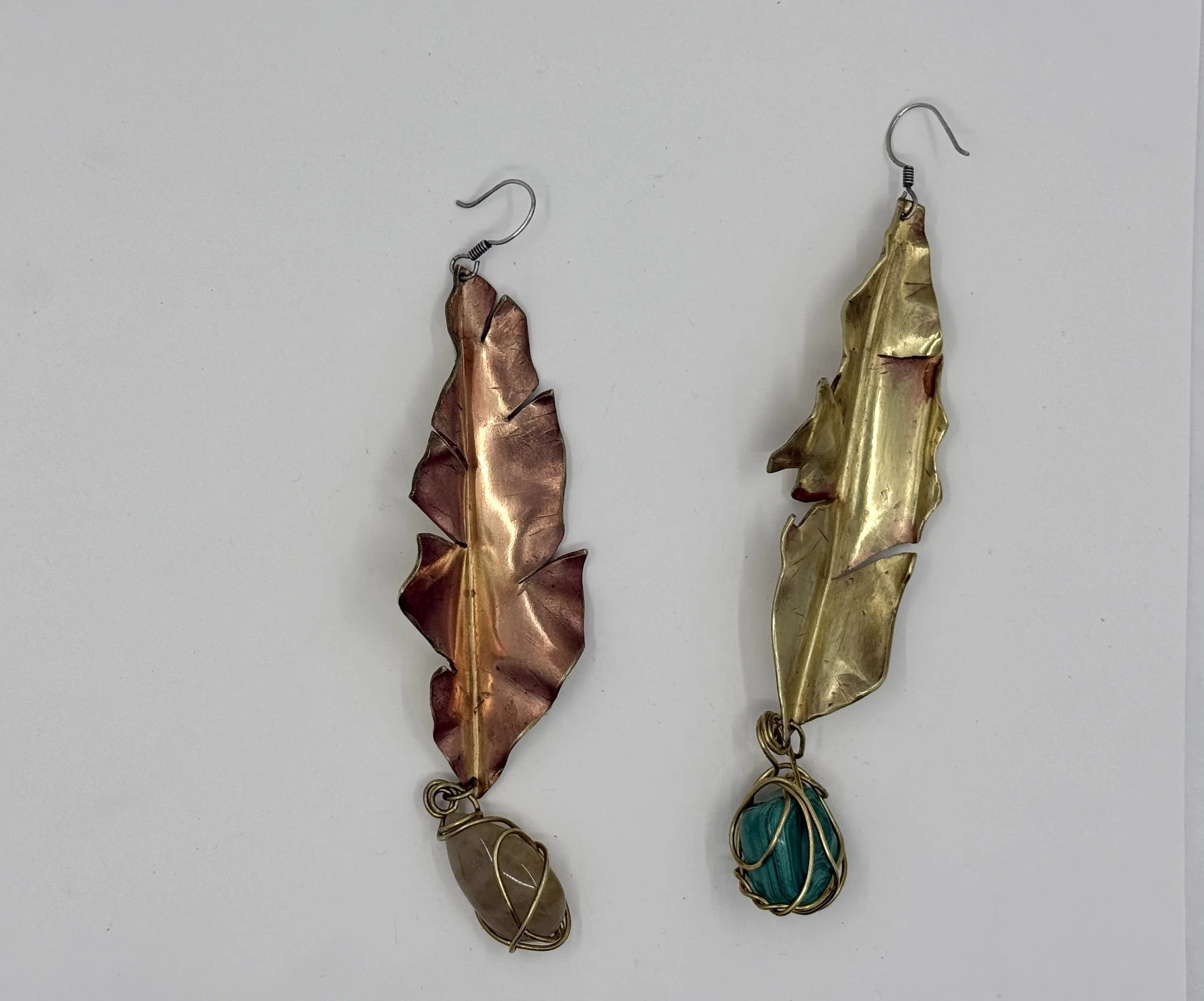
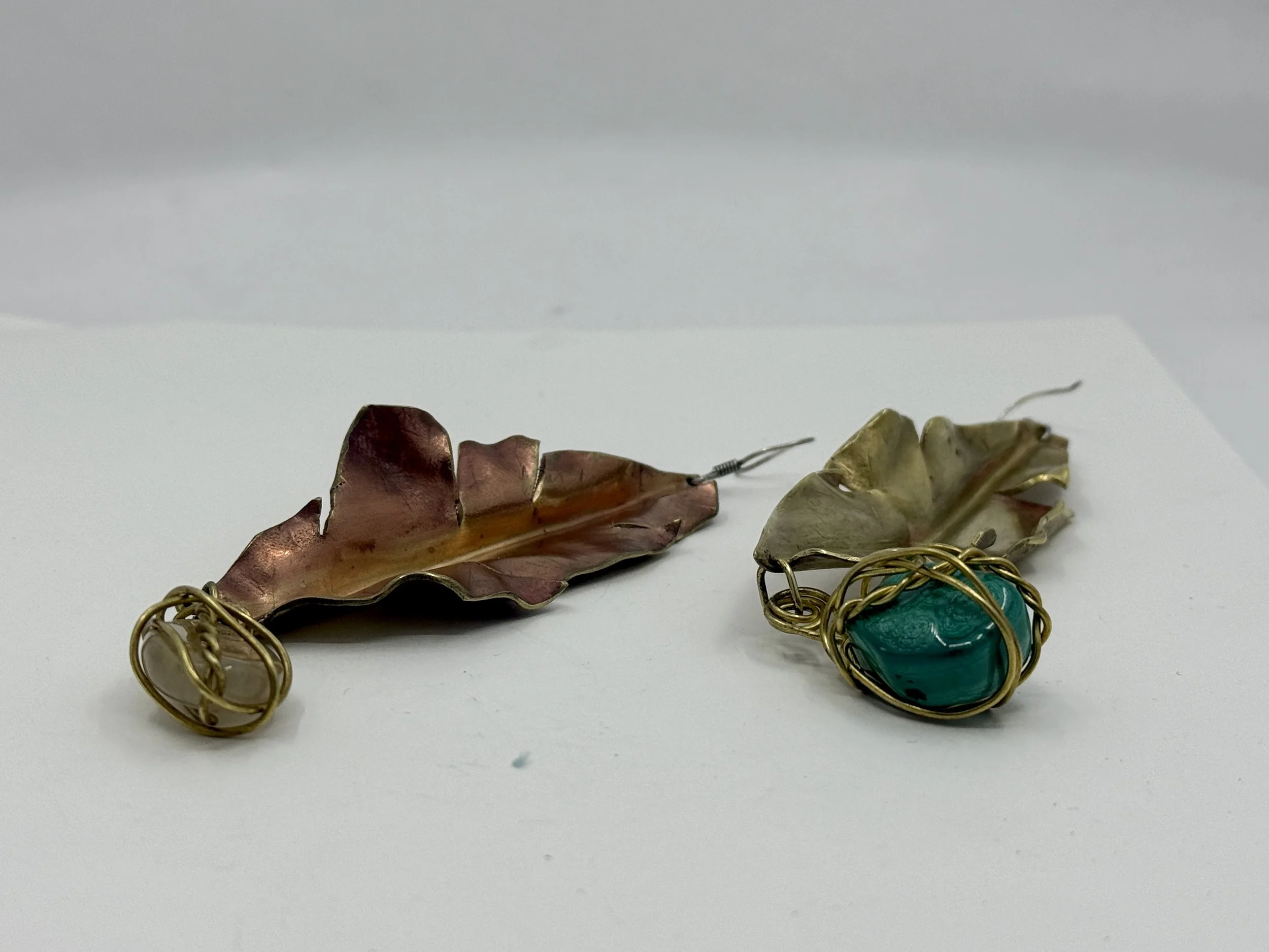
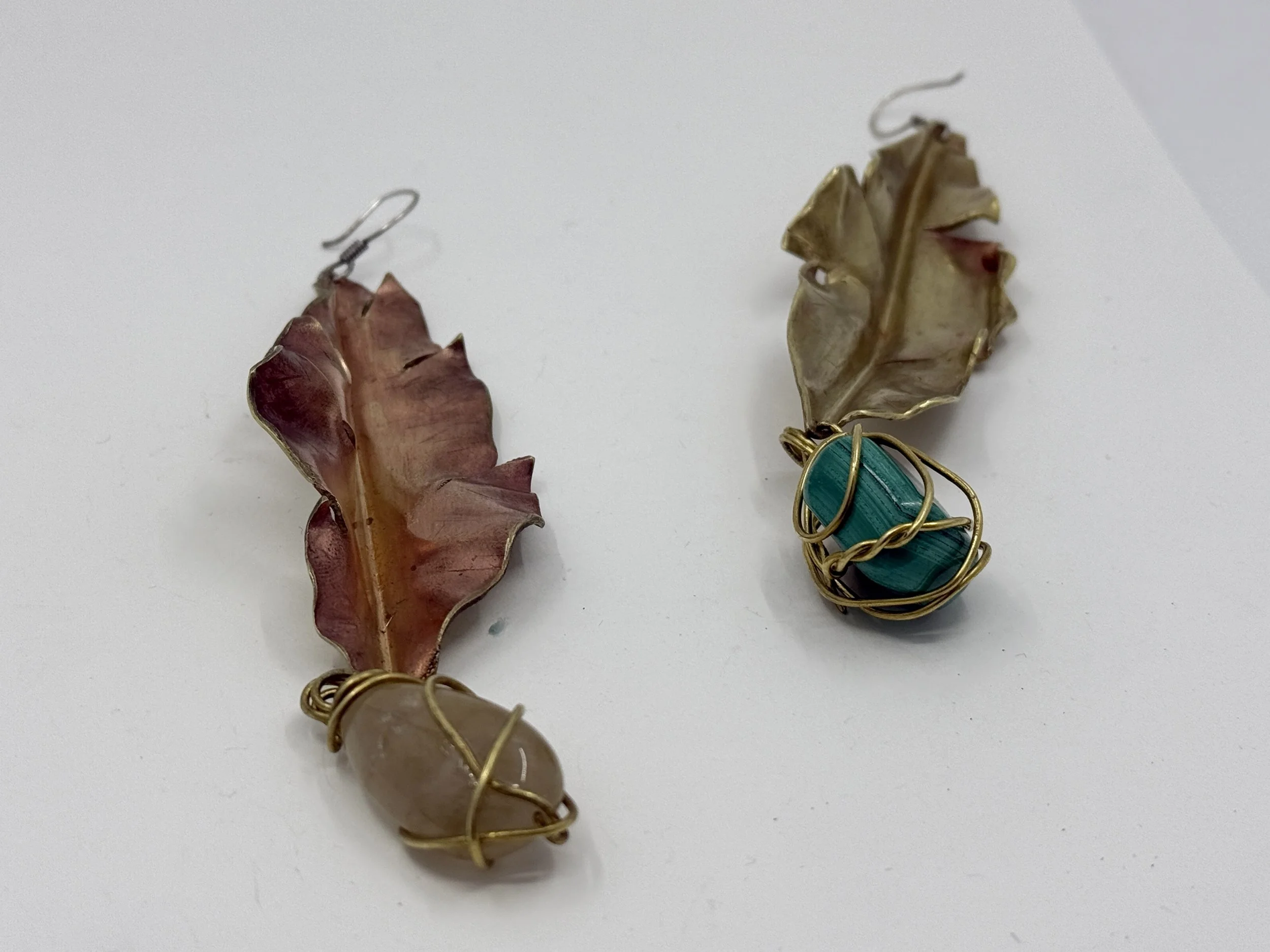
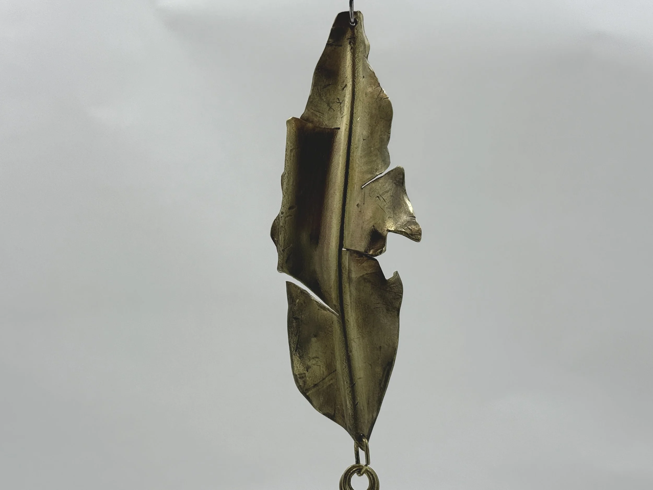
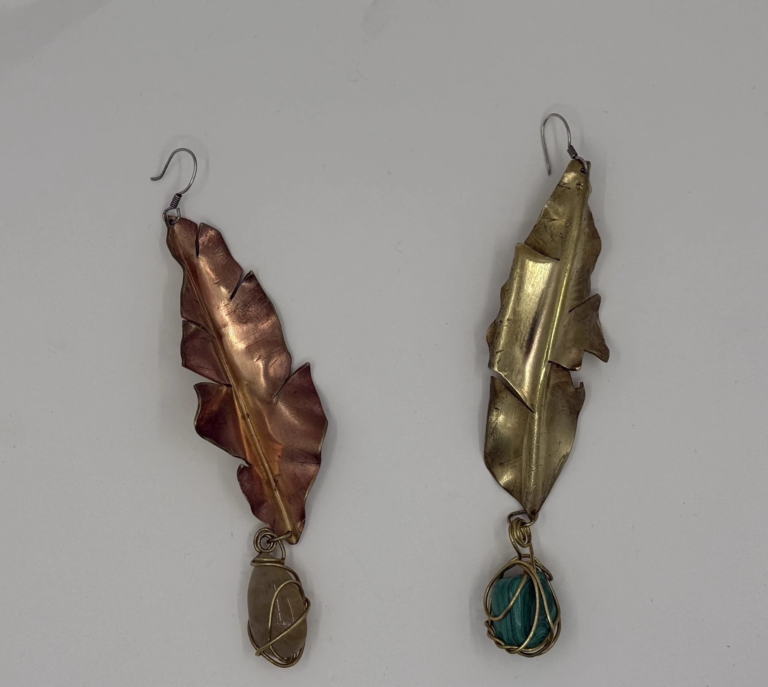
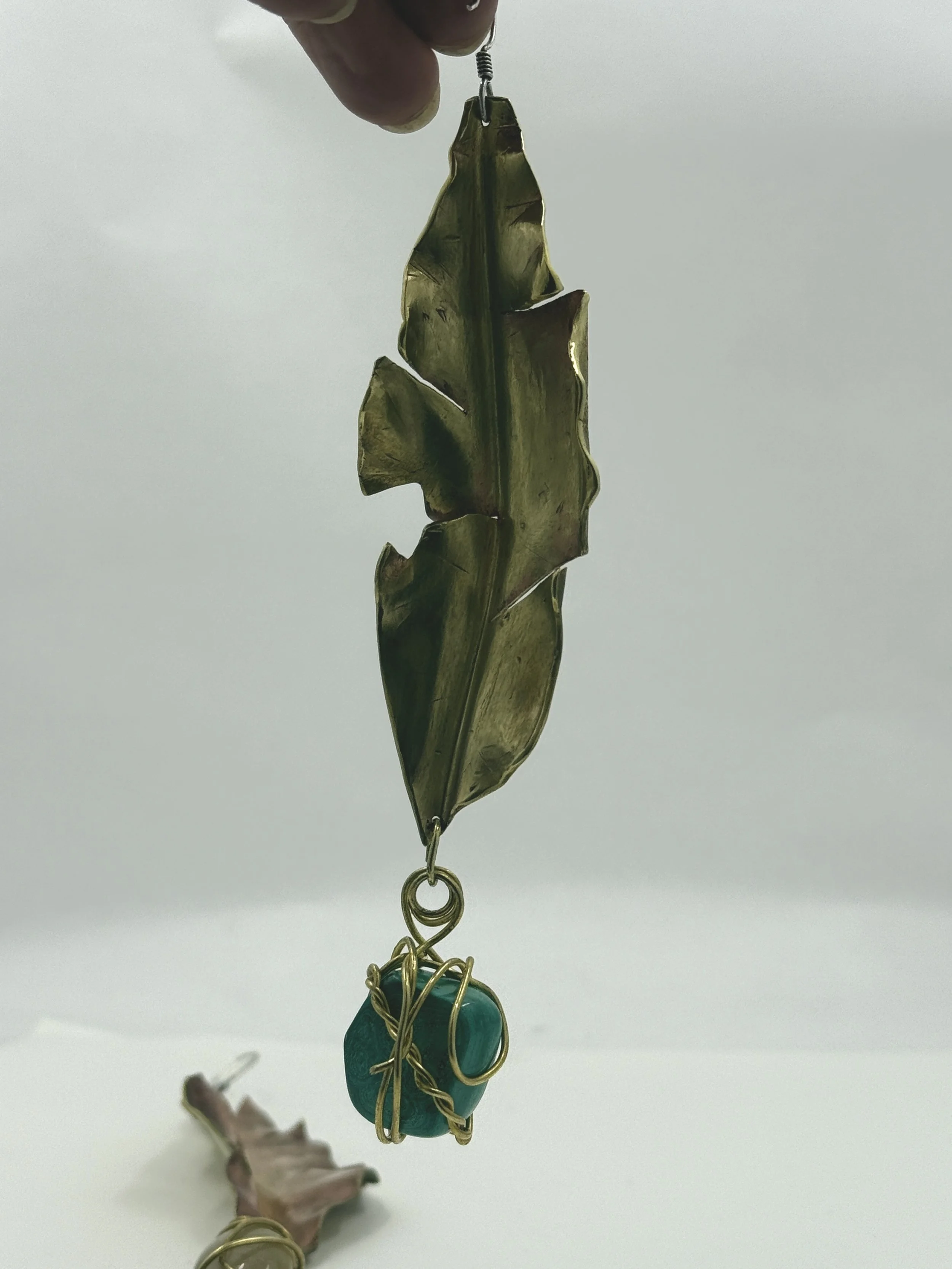
TURNING A NEW LEAF EARRINGS
Camille Andrews
2025
Brass
These earrings were created with the intention of wearing them to my college graduation. I kept the pink heat patina on one of the earrings and omitted it from the other to signify transformation and the turning of a new leaf as a prepare to graduate. When worn the earrings are in opposition of sides—so one earring is worn with the inside facing front while the other has its back facing the front of the face.


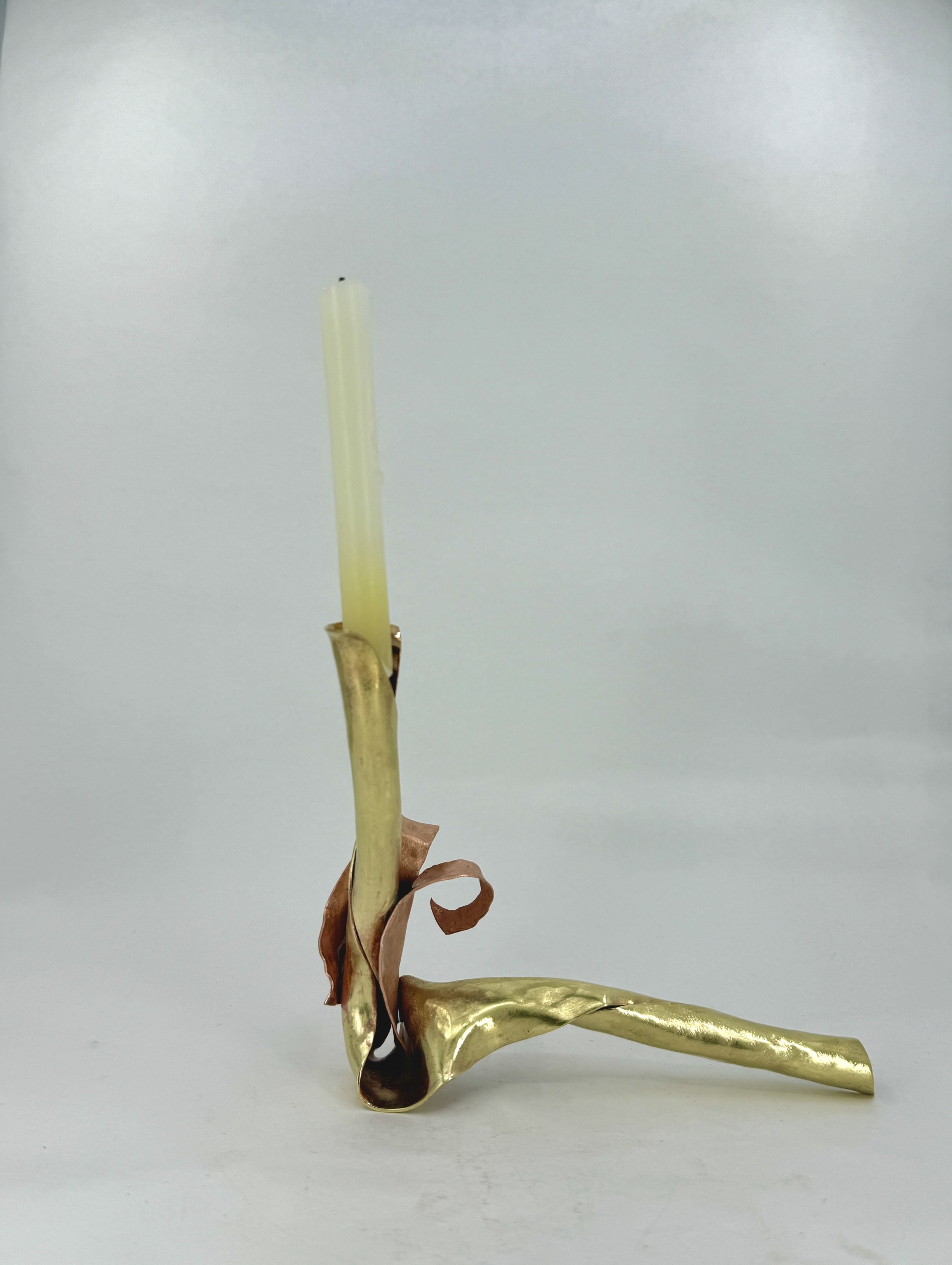
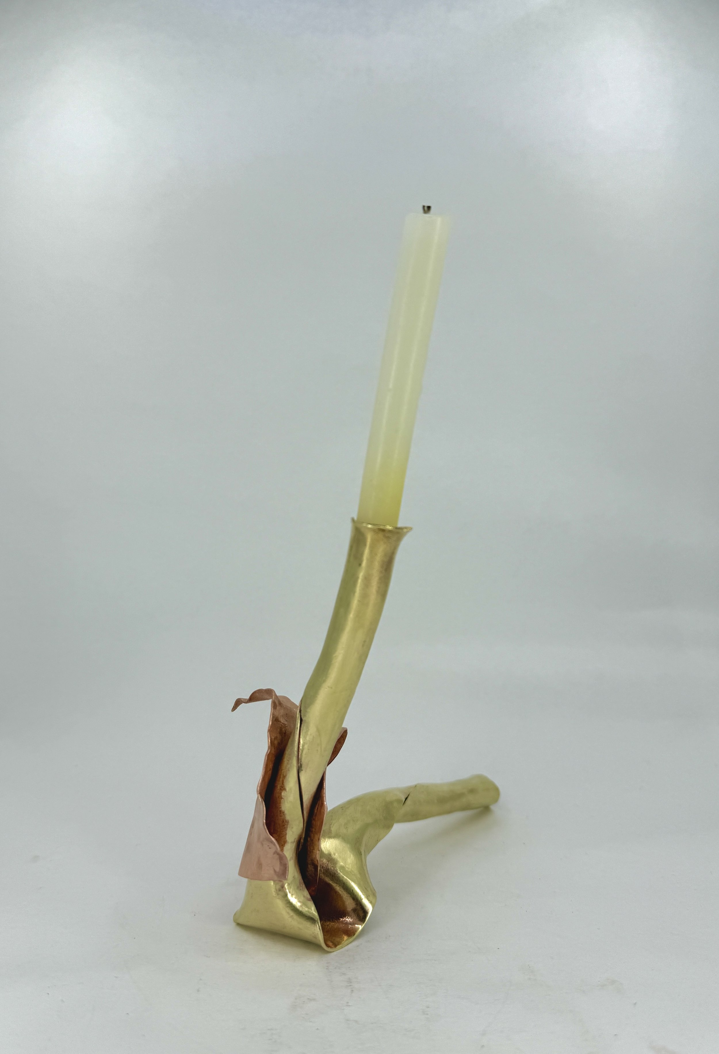
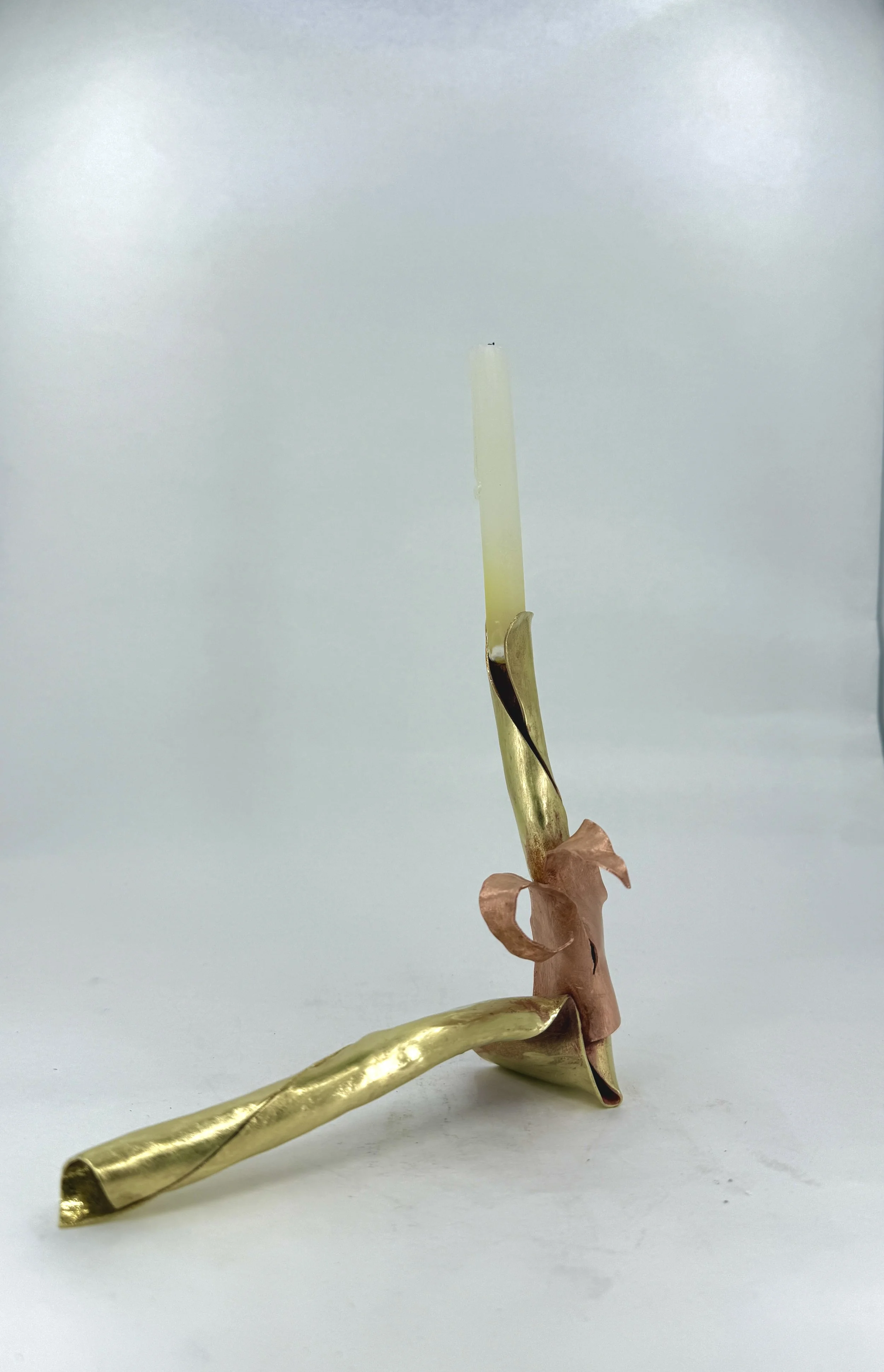
orchids from flames
Camille Andrews
2025
Brass & Copper
The ritual my piece address is my process of getting ready for bed in candlelight. Like my relationship to sleep and bedtime routines I initially struggled nailing the initial conceptual designs of what I wanted my piece to look like. Sleep has always been a struggle for me and the pressures of a proper ‘night time routine’ always felt so crushing. Adding candlelight into my nights as an adult altered the way I operate in the night. Flames blossom into the sky sending my intentions and wishes to the universe—the candlelight bridges the gap between me and the doom darkness represents to me. Maybe growing up with a nightlight permanently altered my relationship with darkness as it’s something I can admit I am still afraid of when I’m alone. While I am not religious I grew up attending a catholic church and I feel like evidence of this often unintentionally reveals itself in my work . I usually attribute this to the symbolic nature of creating ‘religion’, values, morals, and ideals in myself and in my life. The technique I implemented in this piece was a hybrid of shell forming, synclastic, and anti-clastic forming. It was important to me that the form take an organic shape, I think the relationship between metals and fire was an interesting concept. I wondered how I could take a medium such as metal and give it a fluid, floral, and dainty shape and essence. I wanted it to emulate the natural elements, earth, air, fire, and water. As something that most likely will sit on my bathroom counter or on my bathtub I wanted it to feel like something that was formed from within earth.


Over the Mountains & to the Moon
Camille Andrews
2024
brass, sterling silver & ribbon
My piece portrays the omniscient presence of the souls belonging to the women of my family who preceded me yet remain within me to guide, comfort, and protect. By tracing images, maps, clothing, and various familial treasures I began to cut and splice differing parts of these images and arrange them in compositions I found embodied unity—and an alliance.


THE SEA RING
Camille Andrews
Nickel, paint
2024
This piece is a testament to my relationship with the ocean. a symbol of vast beauty and the embodiment of the sublime. a messenger of Mother Earth, the ocean is not a force to reckon with.
I chose to represent my relationship with the ocean due to its parallels to metal. As the ocean is vast and unforgiving, so too is metal in its shape. This piece became my exploration of my simultaneous awe and trepidation toward the ocean, I aimed to capture the delicate nature of reverence and fear that defines my connection to the sea.


